Heraldry

Mystery Item, Part II

A whole season has passed since DORIS kicked off its popup exhibit 400 Years of NYC Government Records, 1636-2025, featuring some of our favorite items from the Municipal Archives and Library. We also included a “mystery item” from within the Old Town Collection. It looked like a genealogical chart, but its presence generated questions such as, who were these people and how did we end up with it? We put it on display and asked attendees for opinions—and we received some great answers—and some laughs. And, as promised, we’re back with updates. 

Our “mystery item,” believed to be part of the Old Town Records. NYC Municipal Archives.

A few days after the exhibit, digitization specialist Matthew Minor (who has an interest in heraldry) emailed archivist Alexandra Hilton asking if she had more information about the mystery item. She thought that perhaps they could join forces to learn more. Matt made high-quality scans of the bifold document, a side for each of the four lineage charts, to help with the analysis. 

Now, Alex and Matt share their exploration of the origin and meaning of our mystery item.  


Alex: With the magic of digitization, the document suddenly became a lot easier to read. Scanning it over, something caught my eye, and my heart stopped for a second. Was that “Tudor” I just read? I took a second look—yes, yes it definitely was Tudor. Feeling a little faint with excitement by this discovery, I start doing the Tudor genealogy in my head as I glanced at the bottom of the chart, verifying the names I was expecting to see—Queen Mary I of England with her husband, King Philip II of Spain, beside her. 

I didn’t want to spoil the fun for Matt but couldn’t resist sending him a message to get excited, promising him that I wouldn’t spoil anything until he had a turn. Meanwhile, I discovered the four couples whose lineage is charted in the document. 

  1. King Philip II of Spain (1527–1598) & Queen Mary I of England (1516–1558) 

  2. King Francis II of France (1544–1560) & Mary, Queen of Scots (1542–1587) 

  3. Philibert II, Duke of Savoy (1480–1504) & Margaret of Austria (1480–1530) 

  4. King James V of Scotland (1512–1542) & Margaret of Valois (1523–1574) 

Annotated sheet showing the ancestors of Philibert II, Duke of Savoy and Margaret of Austria.

Matt: My background is in art, so I was struck by all the vivid, finely drawn heraldry. Preferring not to work on a screen, I printed a poster-size copy and pored over it. Eventually, I recognized a few names, and by using online resources, came to the same conclusions as Alex. 

“So, someone was trying to marry a hypothetical child of Mary, Queen of Scots to a child of Mary I and Philip II?” I asked her. 

She noted that such a marriage would be a way of preserving Catholicism in Britain. We discussed this and other possibilities (all while exchanging funny memes about royalty). Alex’s knowledge of European royalty is quite a bit more extensive than mine. 

Annotated sheet showing the ancestors of King James V of Scotland and Madeleine of France.

Alex: Luckily, I knew the perfect British person to pepper with all my questions. She’s a DORIS alum and current archivist at The London Library, the one and only—Nathalie Belkin! Likely laughing at my American excitement for finding something “old,” she told me that “these types of things were commonplace around that time” but if we could figure out the type of paper it was on and its dimensions, she’d share it with a contact. 

Matt: I took the document to one of the conservators, Nora Ligorano. Examining it over a lightbox, Nora told me that it was handmade paper, most likely linen fiber. We also noticed that the paper had two watermarks. One was a shield with three fleurs-de-lis, the coat of arms of French royalty. The other we couldn’t quite make out. Since the document was found in an American archive, Nora checked the watermarks against a catalog of historical American watermarks but did not find any matches. This lends weight to the idea that the document (which we measured at 31.5 x 41.5 cm) was made in France, perhaps for official use.  

Alex: Nathalie’s friend got back to her and suggested that we send close-up images of the watermarks to the British Association of Paper Historians. 

Watermark, visible when viewed on a lightbox. Old Town Records. NYC Municipal Archives.

Watermark, visible when viewed on a lightbox. Old Town Records. NYC Municipal Archives.

She also recommended checking out Briquet Online, a watermark database containing the works of noted Swiss filigranologist Charles Moïse Briquet (1839–1918). The idea is to compare a watermark to the images in the database to come up with an estimated date of creation. It’s tedious work but we’re dropping the images of the watermarks here in case you want to try your hand at searching and comparing! 

Matt: In the past, I had studied basic heraldry, so I noted a few interesting things on the document. 

First, several of the escutcheons (heraldry speak for shields) had what looked like collars underneath them. By enlarging my scans and doing a deep dive online, I figured out that the collars show membership in orders of chivalry—specifically, the Order of the Golden Fleece and the Order of Saint Michael. These are the two most prominent Catholic orders, the former founded by a Holy Roman Emperor, the latter by a French King. 

Second, it was fascinating to look at how the different shields were combined in successive generations to show family heritage. It was also interesting that both men and women have escutcheons on the chart, rather than the traditional shield for men and lozenge (diamond shape) for women.  

Our “mystery item,” believed to be part of the Old Town Records (verso). NYC Municipal Archives.

Finally, some of the shields showed the French arms with white fields instead of blue. There were multiple variations for certain families, such as the Tudors. This isn’t strange, and in most cases, I could find a record of them somewhere, but a few stood out. Specifically, the arms used for Elizabeth Woodville (Queen of England and wife of King Henry IV) were unusual. Elizabeth used several coats of arms throughout her life—the Woodville arms, her first husband’s arms, and her own version of the royal arms of England—but none of them look like the shield on the document.  

Having hit a wall, I contacted the College of Arms in London to ask if they could help. I got a response from John Petrie. Sir John is the Windsor Herald, the royal family’s official authority on British heraldry. He told us that unfortunately he could not add much information, although he did note that the pedigrees from this period in the archives of the College of Arms usually don’t have this much heraldry on them. 

Our Findings 

Why was it created? 

While we don’t know for sure, the presence of both the House of Burgundy and the House of Bourbon alongside the Habsburgs, Tudors, Valois, and Stuarts suggests that this document isn’t merely a diplomatic artifact or a marriage chart. Rather, it likely has dynastic, genealogical, and possibly propagandistic significance, meant to trace or emphasize the convergence of major royal bloodlines. 

  • Dynastic display and propaganda: Charts like these were often created to demonstrate the legitimacy, nobility, and interconnectedness of royal bloodlines. The presence of so many recognizable arms—Burgundy, Bourbon, Savoy, Castile, Aragon, Valois—suggests a deliberate effort to underscore shared ancestry among Europe’s Catholic monarchies. 

  • Catholic dynastic unity: These charts visually affirm the intermarriage network of Europe’s Catholic ruling houses at a moment (mid-16th century) when the Protestant Reformation fractured traditional alliances. The selection of these four couples highlights the Catholic dynastic web uniting Spain, France, Scotland, England (via Mary I), and Savoy. 

  • Heraldry as genealogical proof: Before printed genealogies became widespread, heraldic genealogy served as visual proof of lineage. Each shield isn’t decorative—it encodes descent. Blue fields with golden fleurs-de-lis signal France; the red-and-yellow quarterings denote Castile and Aragon; the white cross on red signifies Savoy. 

  • Political statement: By linking these lineages, the document could have served a courtly or diplomatic purpose—perhaps created for a Habsburg or Savoy court—to illustrate how Europe’s greatest royal lines were intertwined and how legitimate claims to multiple thrones (Spain, France, England, Scotland, Savoy) derived from common ancestry. 

What do the four lineages have in common? 

  • All descend from or marry into Burgundian and Bourbon bloodlines. 

  • All represent Catholic royal houses interconnected through diplomacy and marriage. 

  • All reflect dynastic consolidation efforts through intermarriage rather than conquest. 

  • Each marriage carries political symbolism: union of realms, alliance against Protestant England, or reinforcement of Habsburg-Valois power balance. 

What are its origins? 

The document’s characteristics strongly indicate that it’s of French origin, created sometime during the 16th to early 17th century: 

  • The language is primarily early modern French, with some Latinized forms for titles and connective words (e.g., ex, uxor, filius, filia). 

  • The handwriting is a French humanist cursive typical of courtly genealogical manuscripts from about 1550–1620. 

  • The mix of Latin for formal lineage notation and vernacular French for commentary was standard for genealogical charts produced for noble patrons in this period. 

And why is it at DORIS? 

We’re still not sure. It’s not an organic fit for either the Old Town or Dutch records collections but could be part of the early Common Council papers. It would be an unusual gift to the Mayor, but that is a possibility as well.   

Our research has concluded for now, but we’d love to hear your comments! Share what you know below. 
The Design for the Seal of the City of New York

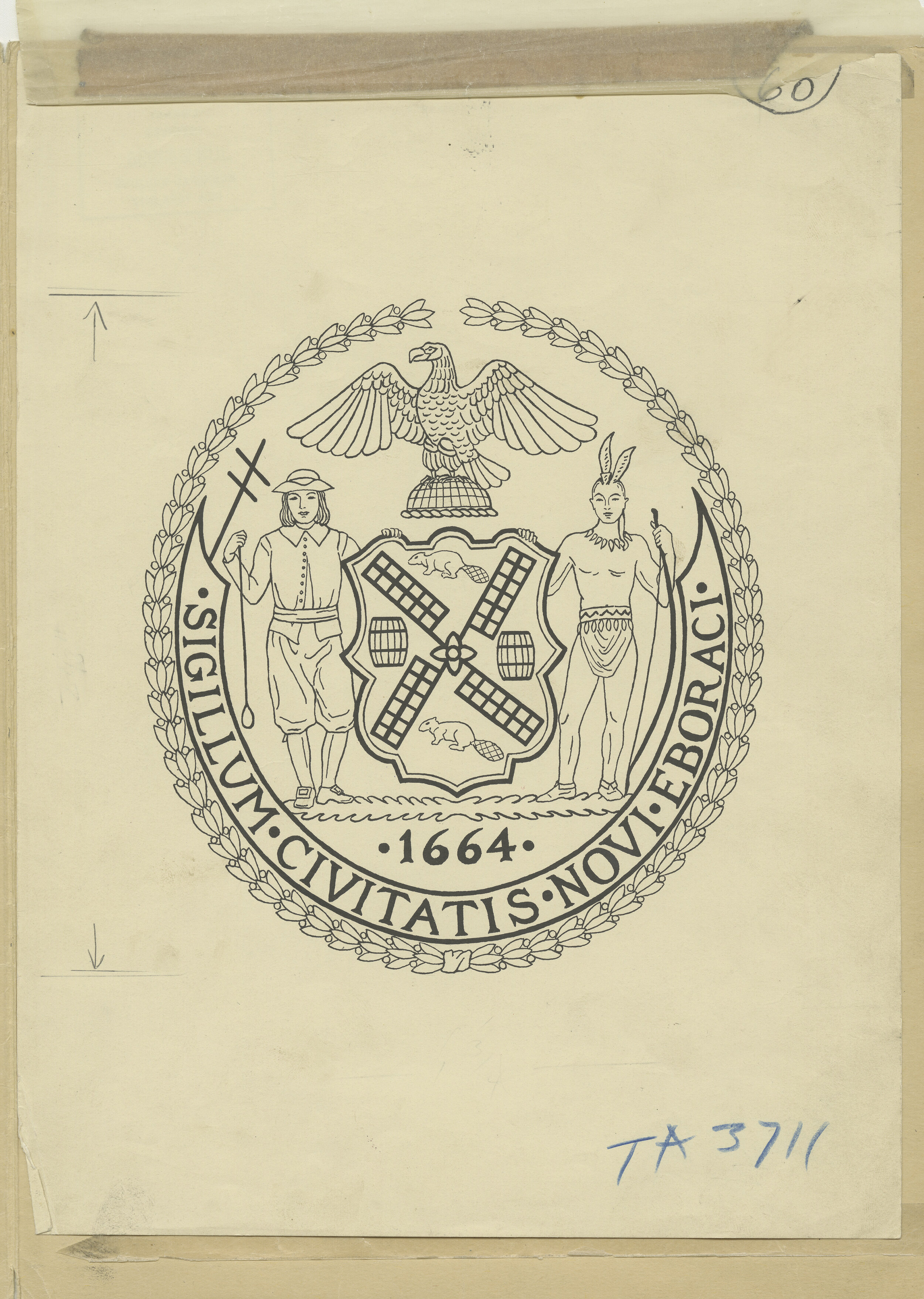
Recently the question of whether the City’s seal has outlived its useful life circulated in the media. The seal is omnipresent on letterhead and other documents issued by City government agencies and officials. While news stories date the current seal to a local law enacted in 1915, the imagery dates back much further. The Municipal Library’s Vertical Files (so called because they consist of file folders of media releases, news clippings and other material held in vertical file cabinets, not shelves) yielded a surprising quantity of material on the subject.

Camera art for the City Seal, NYC Municipal Library vertical files.

Camera art for the City Seal, NYC Municipal Library vertical files.

An interesting history of the City’s seal was published in 1915 in the American Scenic and Historic Preservation Society’s twentieth annual report. Titled “SEAL AND FLAG OF THE CITY OF NEW YORK” it traces elements of the seal to the City of Amsterdam in 1342 at which time William Count of Henegouwen and Holland “made a present to the Amsterdammers of three crosses on the field of the City’s arms.” Not just any crosses but “saltire” crosses which means a diagonal cross—shaped like an X, not a t, and sometimes called a St. Andrew’s Cross. 

City seals and flags are outgrowths from the coats of arms and banners that initially came into use around 1100 when helmeted knights fought in battle. Distinctive color and design were required to identify who was behind a given helmet. An entire craft, heraldry, evolved. This “practice of devising, granting, displaying, describing and recording coats of arms and heraldic badges is complicated.” There are many rules around the shapes, designs, colors, patterns, and division of the shield into halves, thirds, quarters, etc. There is a separate set of directions for identifying where an item should be drawn or placed, consisting of numbered locations within the shield and, most important for our purposes, four cardinal points: chief for the top, base for the bottom, dexter for the left and sinister for the right (in Latin, dexter means right, and sinister left, but the positions refer to the shield bearer’s perspective). The design of New York City’s official seal incorporates all of these practices.

Evolution of the City Seal, NYC Municipal Library vertical files.

One consistent feature on the New York City seal is the image of a beaver. The fur trade formed the basis of commerce for New Netherlands, including New Amsterdam and the beaver was the foremost symbol. Interestingly a beaver both had value as a commodity and as currency itself. In the Scenic Society’s report the author notes, “The intelligence and industry of these little animals, their ingenuity as house-builders and their amphibious character make them eloquent symbols also for the City of New York. So far as we know, the use of the beaver in the arms of New Netherland, New Amsterdam and New York City is unique in heraldry.”

Documentation on the ornamental cast-iron seals that decorated the old West Side Highway shows the evolution of the City’s seal. The Seal of the Province of New Netherland, adopted in 1623, is made up of two shields—the smaller contains an image of a beaver and the larger, which surrounds the smaller, consists of a string of wampum. It is topped by a crown and the outer border is ringed with the Dutch words for “Seal of the New Belgium.”  (Holland and Belgium were united at that time.)

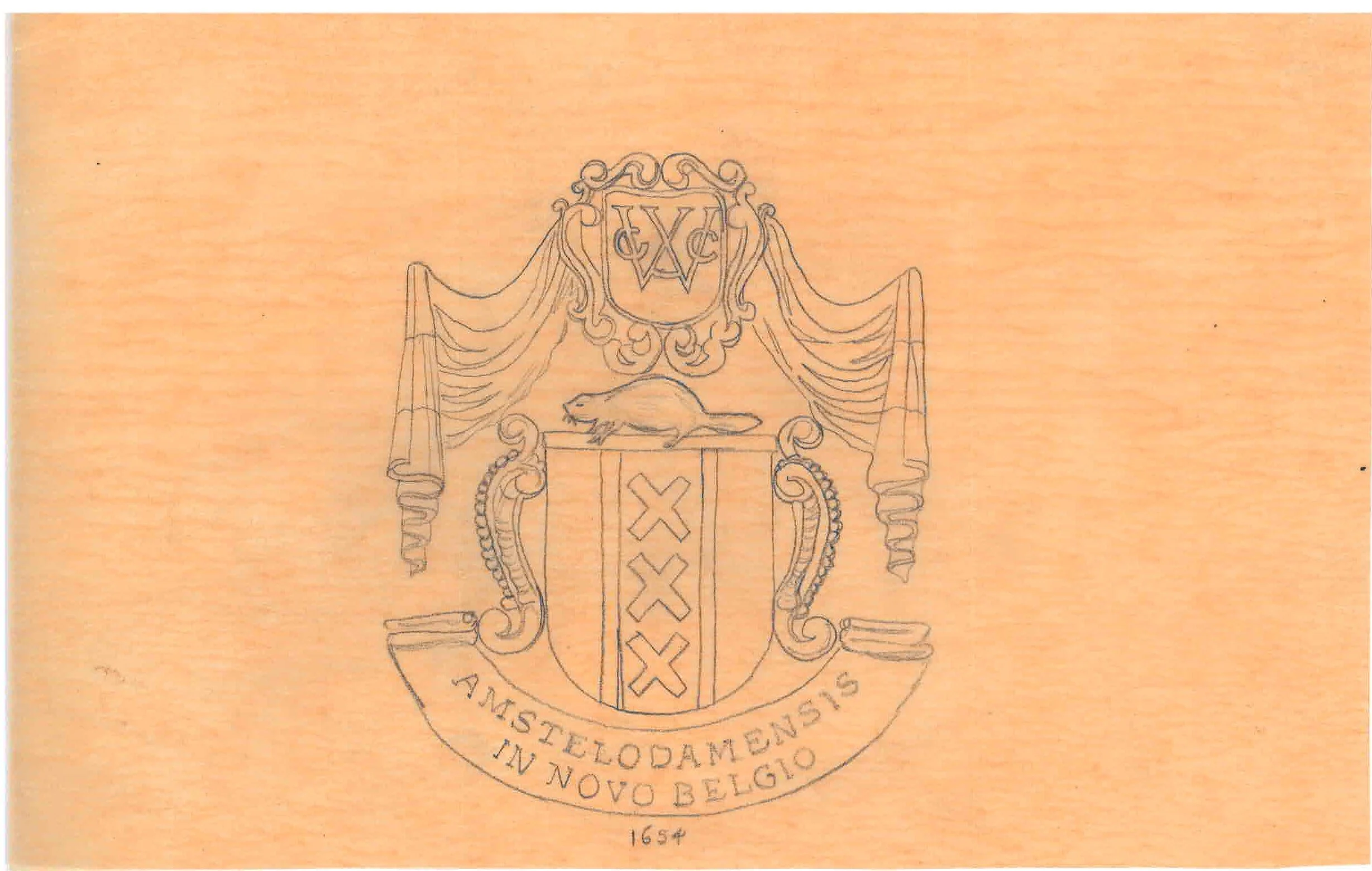
In 1653, New Amsterdam developed a municipal government, the Burgomasters and Schepens, which petitioned the West India Company for its own seal, which was received in 1654. Once again, there were two shields. Arranged one atop the other with a beaver between them, the larger shield contained three saltire crosses. There was drapery above and a label with the words “Seal of Amsterdam in New Belgium” at the bottom.

Tracing of the seal of New Amsterdam, NYC Municipal Library vertical files.

Tracing of the seal of New Amsterdam, NYC Municipal Library vertical files.

Ten years later, the Dutch surrendered New Amsterdam to the English and the City was renamed New York, after the Duke of York. The provincial seal was centered around the coat of arms of the Stuarts and was encircled with the Latin words meaning “Evil to Him who evil thinks.”  There is a crown atop the shield and all is encircled by a laurel wreath. This is the only seal without the otherwise ubiquitous beaver. In 1686, the rights of the City were affirmed by Governor Dongan in the Dongan Charter which also provided for a City seal. In the center is a shield on which the sails of a windmill are arranged in a saltire cross. There are two beavers and two flour barrels alternating between the crosspieces of the windmill. On either side of the shield are human figures—on the dexter side a sailor holding a device for testing the depth of water; on the sinister, a Native American image.

After the British evacuated the City in 1783, the new government updated the 1686 City seal to remove the Imperial crown. Atop the shield they placed an image of an eagle standing on a hemisphere. It’s dated 1686 to commemorate the Dongan Charter and the words “Seal of the City of New York” are inscribed in Latin. Most of these design elements are present in the City’s seal (and flags) today.

Seal of the Office of the Mayor, NYC Municipal Library vertical files.

Sometimes the use of the City seal was contentious. Common Council minutes from 1735 address an apparent wanton use of the city seal without proper authorization and there was some concern that the Mayor was not providing the Council with use of the seal. The Council passed an ordinance that “lodges and deposits the common seal in the hands and custody of the Common Clerk” of the city—today the city clerk—and further banned alternative city seals. The ordinance restricted the use of the seal to actions taken by the Common Council or the Mayor’s Court.

A review of the archival records in the Office of the Mayor collection starting with the so-called “early mayors” shows that correspondence was not bedecked with official letterhead. In many letters the tops of the pages were blank. In other instances, the name of the agency writing the letter was hand written at the very top of the page, followed closely by the text of the letter, written in flowing cursive. That’s not to say that there wasn’t a City seal in use. But, its’ use was sparing, apparently deployed to certify some official documents, not run-of-the-mill correspondence. A case in point is an 1816 certificate issued by Mayor Jacob Radcliff certifying that a woman named Nancy, approximately 60 years of age, was a free woman and could travel. An embossed seal is embossed at bottom of the document. It bears all the elements of the seal in effect today.

In 1914, a group of former members of the Art Commission was appointed to provide an accurate rendering of the corporate seal of the City, and a design for a City flag. The various departments and boroughs had been using variations of the seal which created confusion about the provenance of official documents.

Based on the recommendation of this committee, in 1915 the Board of Alderman amended the City’s Code of Ordinances relating to the city seal, flags and decorations on city hall. The Aldermen re-established the 1686 seal as updated in 1784 and required it to be used for all documents, publications or stationery issued or used by the city, the boroughs and the departments. They made some minor style changes-the shape of the seal, the position of the eagle, etc. and also changed the date on the seal from 1686, the date of the Dongan Charter to 1664, the year the City was named New York.

It is in this legislation that a major error was made. Apparently the bill’s drafters were not versed in the heraldic arts. As a result, the cardinal directions of “dexter” and “sinister” were assigned as the names of the figures in each location. So the sailor holding a depth reading device was named “Dexter” for the left sided placement and the Native American figure placed on the right was named “Sinister.” How this happened is lost to history. One would think the high-profile former Art Commissioners would have sounded the alarm and corrected the error, which still exists.

In 1975, City Council President Paul O’Dwyer sought to change the founding date on the seal from the existing 1686 date marking the issuance of the Dongan Charter, to 1625 when the Dutch established New Amsterdam. The legislation also invalidated all former seals bearing the 1664 date.

As mentioned, not only is there a City seal, but each of the boroughs have separate seals or emblems dating to the colonial period. After consolidation of the Greater City in 1898, the boroughs continued to use these seals for various official purposes until 1938 when the Board of Estimate mandated that the seal of the City of New York would replace any previous seals that had been in use. Thereafter, the various seals were to be found on the borough flags and not on official documents. But the use of the seal continued to vex officials and in 1970, the Board of Estimate mandated that the seal of the City be placed on each letterhead and restricted the use of a gold seal to the Board of Estimate and the Vice Chair of the Council.

Seal of the Borough of Queens, NYC Municipal Library vertical files.

The flag for the borough of Queens was announced in 1948 after a design competition.  The three-paneled seal included a tulip commemorating the Dutch on the dexter side, a double Tudor rose documenting the English on the sinister side. The border consists of shells used as money “wampum.”  At the very top of there is a crown signifying that the borough was named for a Queen, namely Queen Catherine Braganza wife of England’s King Charles the Second.

According to an excerpt in the files from a 1925 history, “the Boroughs of Brooklyn and Queens, Counties of Nassau and Suffolk Long Island, New York 1609-1924” Brooklyn’s seal was established by the West India Company in 1664.  It consists of an image of the Roman goddess Vesta (equivalent to the Greek goddess Hestia) holding fasces—or bunch of rods and an axe bundled together.  Apparently, this reflected the colony’s agricultural status. The motto surrounding the seal translates to “unity makes strength” which in 1664 was an update from the 1556 motto on the coat of arms of William the Silent, Prince of Orange. When the Village of Brooklyn officially incorporated in 1817, the seal was adopted by the common council.

Seal of Staten Island, NYC Municipal Library vertical files.

The seal of the Borough of Richmond, aka Staten Island, has gone through several evolutions. The Dutch named the island after the “Staten General” of their legislature. One seal consists of two doves facing each other with the letter S (for Staten) between them and N YORK beneath their feet. Another early seal has a female figure gazing toward the water in which two ships sail, one purportedly Henry Hudson’s Half Moon. In 1970, the then- Borough President held a contest to develop a better emblem. The winner was an oval with waves surrounding an island with birds flying in the sky above and STATEN ISLAND written between the waves and the island. However, this design was not universally admired. The Staten Island Advance reported that current Borough President James Oddo redesigned the emblem in 2017 to incorporate elements of the woman gazing out on the Verrazzano Narrows as well as oystermen, a moon and stars.

The Bronx, by contrast, maintained its seal, adopting the coat of arms of Jonas Bronck who settled in the area in 1639. A sun rises from the sea and a globe topped by an eagle stands above it. The Latin motto under the shield translates to “do not give way to evil.”  This same design was the basis for New York State’s post- revolutionary coat of arms.

Brooklyn Markets Seal, NYC Municipal Library vertical files.

Brooklyn Markets Seal, NYC Municipal Library vertical files.

Notwithstanding this requirement that the City seal be use on all official materials, some agencies developed their own seals. In 1940, Mayor Fiorello LaGuardia announced the conclusion of a contest, with a $10.00 prize won by a high school student, to design a seal for the Department of Markets. The seal featured a scale, a bundle of wheat and two full cornucopias. More recently, the New York Police Department (NYPD) developed a seal described in the agency’s 1987 annual report. It’s a somewhat cluttered design with the names of the five boroughs creating an interior ring. The City seal is at the bottom and the upper portion includes the words Lex and Ordo (Law and Order). The scales of justice are balanced atop the fasce and what looks to be a rocket (but probably isn’t) explodes from the top.

NYC Housing Authority Seal, NYC Municipal Library vertical files.

NYC Housing Authority Seal, NYC Municipal Library vertical files.